Back to Hub
UI/UX Design Beginner
Mobile-First is a Constraint, Not a Screen Size
October 11, 2024
5 min read
P
Portfolio OwnerIn this article
- Start with the smallest screen to force prioritization.
- Hover states don't exist on touch screens.
- Performance is a UX feature on mobile networks.
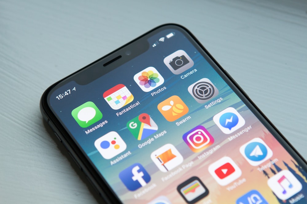
Many developers still build the desktop view first and then 'squish' it for mobile. This approach leads to heavy pages and poor navigation on phones. True mobile-first development is a constraint that forces you to decide what is truly important. If it doesn't fit on a 375px screen, is it actually necessary for the desktop user? I explore how this mindset shift improved our conversion rates by removing distraction.
On this page
Introduction
Key Takeaways
Detailed Analysis
Conclusion
Share Article
Related Topics
#Responsive Design#Mobile First#UX Strategy
Perfect For
- Designers
- Frontend Developers
Share:
#Responsive Design#Mobile First#UX Strategy
